Tuesday, October 5, 2010

"Veronika Noir" step by step.

Early this spring it rained record amounts here in New England. Subsequently my studio, which is in the basement, was flooded out. I painted this in my kitchen in the the midst of the chaos that is my home. Not ideal by any stretch of the imagination - but it worked. This first shot is the sketch transferred down to a sanded, gessoed canvas stretched over a quarter inch piece of masonite. It measures 24 x 16.

At this point I decide what the general colors of the piece will be. I mixed cadmium orange with it's near complimentary, french ultramarine blue. I say near because oil pigment is made from organic mater and are and are impure. I mix the two colors until they don't lean toward the blue or the orange. It looks like a big coffee stain.

Next I established my darks. I had just seen a bunch of Shawn Barber's art. He has an amazing loose, painterly style. I was inspired and wanted to try a much looser approach to my background. I love the look. I paint pretty tight and it was actually a test of strength to see if I could leave it alone in the end.

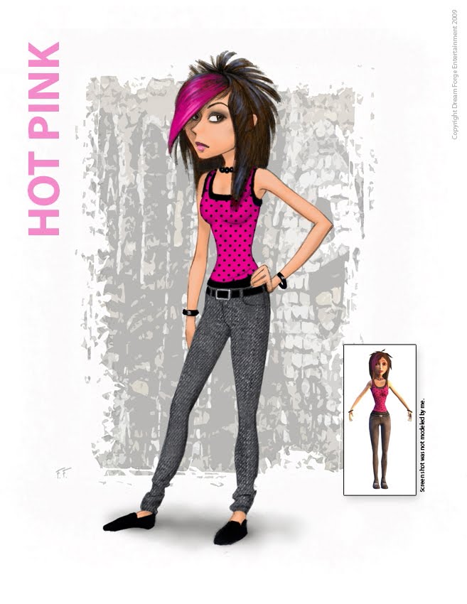
Next I blocked in the general colors. Cool blues in the shadows and warm oranges in the lights (skin tones).

Next I painted in the skin tones and hair. Not much else to it. I had a very difficult time photographing the painting because of it's stark nature. I managed to leave the background loose as planned..

Although Just to make sure, I took shots of the painting and in Photoshop I filled in the background just to make sure I liked it. Typical!


The model for "Veronika Noir" was the very lovely Veronika Kotlajic. Veronika is muse, designer and the very cool owner of Gallery Provacateur in Chicago.
http://www.narcissedesigns.com/
Shawn Barber: (mentioned above) I've never met the man but I'm a huge fan. If you're not familiar with his work give yourself a treat: www.sdbarber.com/

Tuesday, September 21, 2010

"A Dog and His Cowboy" step by step.

After transferring my finished drawing to the painting surface I spray it with a spray fixative to assure that the drawing won't run or smear. Then using raw umber and turpenoid (turpentine substitute) wash I establish my darks.


Once the umber wash has dried I wash in the basic colors.


After the undercoat has dried I begin using the paint in a thicker manner. I start with whatever is the furthest back in the painting. Background, mid ground and then fore ground. As the background becomes further away from the subject there is less indication of details.


The Dog is next. Although I try to work from back to front I always run into situations where two object overlap one another. In this case the dogs muzzle overlaps the cowboys face and the cowboys nose overlaps the dog's forehead. Someone with their arms cross causes the same situation.

Finally I finish out the Cowboys face, clothing, hat and jacket.


Thursday, September 9, 2010

Cartoon Character designs

In 08/09 I did a bunch of cartoon character designs for a game called Mad Doc Jr's Doom Rails. The following is a smattering of those designs. It was a kind of dark carnival meets haunted house, cart battle game with an inordinate amount of clowns in it...I just did the art. Enjoy!

My evil chimp.
Apes in zoos always have one shoe. The car battery and ring bologna just amused me.

Gavin the Bomber Clown.

Gavin orthographic

Bud. This one wasn't for the game. My fellow concept artist, Davi Blight runs a creature concept blog http://www.creaturespot.com and I really wanted to contribute to it. Those of you who are fans of my gallery work may be a little disgusted right about now. I understand.

This was a sort of boogieman in the closet monster. I had one just like it when I was a young lad.

Chicken Juggler.
The thought of someone trying to juggle chickens struck me as funny. Chicken poop flying and eggs popping out all over... I figured his face would be scratched all to hell and slightly infected and swollen.

I don't personally like clowns and I had to draw a lot of them for this game.


Yer garden variety ghost.

Haz-mat clown.


Hot Pink was one of the characters you could play in the game.

Leper the Clown.
I liked and, at the same time, was repulsed by the puppet. Sadly, he never made it into the game.

Li'l Nosferatu.

Clowns.

An Elephant Man.

Ally Gator...(Whatever)
Hard to make a cartoon gator without it resembling the croc in Disney's Peter Pan. I don't think he appeared in the game, anyway.
The Gimp

A couple of goblins. I thought the one on the right looked a little like Jack Nicholson in The Shining (with moobs).

Another Closet creature. He appears in the game but without the cloaca.


Jam Eater. At first glance he's a machete wielding psychopath but after closer examination he's just a messy sandwich maker.

Piper.

Mad Scientist and son.

This was kind of a generic evil hunchback assistant character.

This is a more modern day version of the same character. He has on his tool belt (from left to right) a ring Bologna, a dead weasel, a turkey baster, a tire gauge and a brain in a zip-lock bag. He also has a small hat for his tooth.

A maid and butler set of ghosts.

Phideaux was a digger.

Trudy the bipolar trapeze artist and the lion tamer.

My floating Alien was done for a different game for the same company. It was the last concept I did before leaving the company.


Tuesday, August 31, 2010

The Illusion of Depth

Once There Were Buffalo (detail)

An illustrator asked me for a critique of his work a couple of weeks ago. One of the things I noticed was the lack of depth in his work. Depth is when you create the illusion that one object is further from your eye than another object or that two objects next to each other are actually much further apart. The appearance of depth is caused by the amount of atmosphere between two objects. Atmosphere, generally consists of moisture, dust and pollution. This causes darks to become lighter the farther they are from your eyes and lights to become darker the farther they become from your eyes. I paint from back to front. Meaning background, mid ground and then foreground. I mix my background colors more toward the color of the sky and the values more neutral. As an added measure I will wait until the background is dry and then take a medium value color from the sky background and go over the whole thing with a thin wash. Sometimes I'll interpret the background as having several layers and will put different layers of wash to create that effect. This will not work on a sunset since the color blue often gets filtered out as the sun goes down. The thicker the atmosphere is (i.e. dust, fog, humidity, rain, smoke, sea spray) the fuzzier the edges and detail of far off objects will be. This can easily be seen in maritime paintings. One of my favorite contemporary artist, Robert Bateman, is a master at creating mood with the use of depth. http://www.robertbateman.ca/art/arttitlepage.html

Lonely Are the Brave
I divided the background into four layers, the far off hills, the trees on the far side of the river, the opposite river bank and the ground that the pinto is standing on.


Cuttin' Through the Dust (detail)

This was one of the driest summers during my time in AZ. The dust (and manure) went air born like talcum powder.


"Teetering Peaks", Magic the Gathering card art

In this illustration I exaggerated the narrow depth of field because of the small reproduction size of the trading cards. The terrain reminded me of the Tonto National Forest, northwest of Phoenix. Very coyote and roadrunner.


Thursday, August 19, 2010

Color Studies

I don't do a lot of color studies. To me it's like painting a piece three or four times. In a case where I really don't know what I want to do with my subject matter I do a quick sketch, (in this case) make three copies, mount them on illo board, coat them with matte medium and paint different versions of the painting.

In this case all three are the same color harmonies. Red and it's complimentary on the color wheel, green. The first has most of the reds in the face while the background is green. The second is predominantly reds with green hints. The third is the classic dark background that the dutch masters made famous. They all work. The center is the one I chose to paint. Probably today I'd chose the dark background or some other kind of background altogether.Maybe a cracked adobe wall or something contemporary.

Navajo Elder

Saturday, August 14, 2010

Using the Golden Rectangle

A golden rectangle is one where the length and the width are in the golden ratio or phi, approximately 1:1.62. It is thought to be a more aesthetically pleasing or ideal rectangle.


It occurs in nature in the form of leaf and seed patterns, sea shells, storm systems and galaxies. It even occurs in DNA.


The ancient Greeks knew of the rectangle. It was used extensively in the design of the Parthenon in Athens. At least since the Renaissance many artists and architects have proportioned their work to approximate the golden ratio.
There is extensive information online about the Golden ratio and the Fibonacci sequence that goes far beyond my interest or attention span. However if you are so inclined: http://en.wikipedia.org/wiki/Golden_ratio


My interest in the ratio is in it's aesthetically pleasing nature and how I can use it to assemble a better painting. Below are examples of paintings where I used the rectangle, as a compositional tools.
Nude With Butterflies
Jubilant
Red Shirt and Yellow Boy